Colour Techniques in Flyer Design For Impactful Marketing
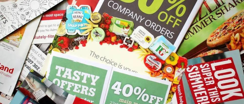
Flyers are an important marketing tool for offline marketing campaigns, especially for reaching your target audience within a selected budget. They can effectively convey your brand message or campaign information on a single piece of paper.
When designing flyers, the right color selection and engaging text can make all the difference. These components may be overlooked by business owners who are unfamiliar with the color theory but fret not, this article will explain how to use colors effectively to create impactful flyer designs for your marketing campaigns.

The Role of Colors in Creating Impactful Flyer Designs
A well-known theory in the field of art and design, the “Color Psychology and Design Theory”, serves as a general foundation to create exceptional artwork.
This theory emphasizes the use of colors to evoke specific emotions and feelings. Colors can be categorized into Warm Tones and Cool Tones based on their perceived temperature.These aspects are highly significant in flyer design to create engagement and elicit emotional responses, thoughts and behaviors from their target audience.
The Influence of Colors on Human Perception
-
Red: Strategically employed by marketers as it symbolizes excitement and passion. Its vibrant and attention-grabbing nature makes it particularly suitable for marketing campaigns that aim to capture attention, such as limited-time promotions or flash sales.
-
Orange: Warm and bright color that evokes a sense of friendliness and playfulness. It’s suitable for creative and fun, engaging campaigns.
-
Yellow: Represents happiness, optimism and positivity that is suitable for campaigns targeting children and young people. It’s particularly effective in promoting fun and joyous experiences.
-
Green: Symbolizes nature and growth, it’s also ideal for campaigns promoting environmental friendliness, sustainability and health-related products.
-
Blue: Instills trust, loyalty and stability. It’s perfect for campaigns related to insurance, finance and investments, aiming to promote credibility and safety.
-
Purple: Evokes a sense of luxury and spirituality, it’s well-suited for campaigns targeting the middle-class and affluent society. And is effective in areas such as real estate, luxury goods, premium services and even horoscope-related events.
-
Pink: Symbolizes love, romance and femininity. It’s suitable for campaigns promoting beauty and cosmetic products. In addition to couple-themed campaigns and raising awareness about breast cancer.
-
Black: Evokes a sense of elegance and luxury that’s important for campaigns promoting luxury goods and high-end services or events that require a sophisticated aesthetic.
-
White: Represents innocence, purity and simplicity. This color is suitable for campaigns related to cleaning and health products, and also useful in flyer designs that require a clean and minimalistic approach.
What Are the Benefits of Designing Flyers Using the Principles of Colour Psychology

1. Enhance Communication Effectiveness Based on Campaign Objectives
Utilizing color psychology when designing flyers can significantly enhance the communication power of campaign flyers. By choosing colors that align with your campaign objectives, it can help capture the attention of readers and establish a better understanding of the intended message.
2. Help Make Important Text or Messages Stand out
Color psychology can also help create clear distinction of any important text or messages within the flyer design. This can be achieved through techniques such as color overlay or adjustment in text color to highlight the campaign message or Call To Actions. These flyer design techniques will generate engagement and sales to effectively increase visibility and success of the campaign.
3. Reinforce Memorable Branding
Businesses should establish your Corporate Identity (CI) brand colors with reference from color theory psychology in order to effectively communicate the essence of your business and your brand values. Once the brand colors & identity are established, the same can be implemented in all marketing media, including flyer designs and online & offline media to reinforce the brand identity and strengthen brand recognition among your target audience.
Colour Selection Tips in Flyer Design
-
Choose color palette that align with the brand’s CI
-
Use complementary colors to create dimensions in your design and make your flyer stand out
-
Utilize colors to evoke emotions and stimulate engagement based on the principles of color psychology
-
Avoid cramming details or use excessive number of colors
-
Create drafts to select the best color combinations for your design
We hope this article provides a little more understanding behind color theory & psychology and contributes to more effective flyer designs. For those who need urgent flyer printing, do consider Ontimeprint Singapore, the most convenient and fastest online printing service provider.
We are dedicated to ensuring customer satisfaction by providing efficient and timely delivery services. Simply upload your artwork files on the website and place your order, and we will deliver the items to you within your specified timeframe. We guarantee fast delivery without any additional fees, offering a hassle-free experience for our customers. If there are any delays in delivery, we are happy to refund you! If you are interested and have further inquiries, please contact us via email: [email protected] or call 3159 3040


